Thursday, 18 August 2016

The Secret Formula Of A 13.11X ROI Google AdWords Campaign

Do you want your AdWords account to do more than just get you some clicks?


Do you want people who are searching for your product and services on Google to find you and buy from you?


If you do, then read on…


I came up with a formula for building AdWords campaigns that ROI in any industry.


I tested it with my eCommerce business, a SaaS business and a local service business.


1 thing is consistent… Predictable ROI.


Why?


This formula gives the person searching on Google exactly what they are looking for (whether that's chocolate chip cookies, your software product or eCommerce product).


After executing the “The Cookie Monster Formula”, the number of conversions I got (leads and sales) shot up like a rocket:


adwords-campaign-results


More importantly, this 1 campaign made my company $4,500 profit.


Yeah, I know, I know… that is chump change for most of you corporate execs.


But this AdWords campaign structure is SCALABLE.


The more search volume you have for your keywords, the bigger you can scale your ROI.


And I'm sure your business has more search traffic than my small business in Brisbane, Australia where half the population is made up of kangaroos.


But the question is…


Do you want to scale 13.11X ROI?


Also, as a nice bonus, you can get more high value email leads.


This 1 campaign has driven 155 new high 'buy-intent' leads onto my email list.


Not just 155 email leads who have a casual interest in what I offer.


155 email leads who opted-in to download pricing for my exact product.


The best part?


You can do the same thing for your company – even if you don't have a Fortune 500 marketing budget or have never run an adwords campaign before in your company.


Replicate This AdWords Campaign Structure In Your Business for Massive ROI


To attract high quality leads and sales with AdWords…


All you have to do is remember to use “The Cookie Monster Formula”.
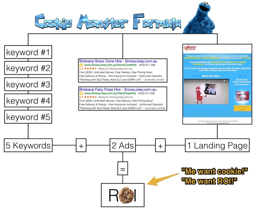

cookie-monster-formula


In every ad group you have:


  • 1-5 keywords

  • 2 ads

  • 1 landing page


If you have a high enough volume of traffic (250-400 conversions per variation per month) to get statistically valid data, then you should also be a/b testing your landing page.


How My AdWords Campaign Broke Down After Implementing The Formula


Again, here are the results:


adwords-campaign-results


6% of people who saw my ad, clicked on it.


59% of people who clicked on my ad converted into a lead for my business.


Now remember, I can't go giving my whole AdWords campaign data away ;)


This is just 1 ad group in 1 of my campaigns from last financial year. This ad group is highly targeted with only 2 keywords. That is why my impression and click data is low. But this ad group converts like crazy.


It is also simple, scalable and repeatable across all the other products, services and geographical locations I service in my business.


I only had to spend $343 to get 155 leads!


That is 155 people who have already entered the buying cycle and looking for a solution. How do I know this?


Because Google is an 'intent-based' advertising network. People searching for product/service keywords like mine have commercial intent. Compare that to social ad networks like Facebook and Twitter, which are 'context-based'.


The people you advertise to on social networks may or may not have entered the buying cycle for your particular product or service. So you generally need a more sophisticated sales funnel to convince and convert them into becoming your customer.


Would you place more value on a lead that is actively searching for what you sell on Google? Or someone who stumbled across your ad while scrolling through their social news feed and just opted-in because they were 'interested'?


Not all leads are created equally.


Case Study: The AdWords Campaign, Landing Page And Sales Funnel I Used To Make 13.11X ROI


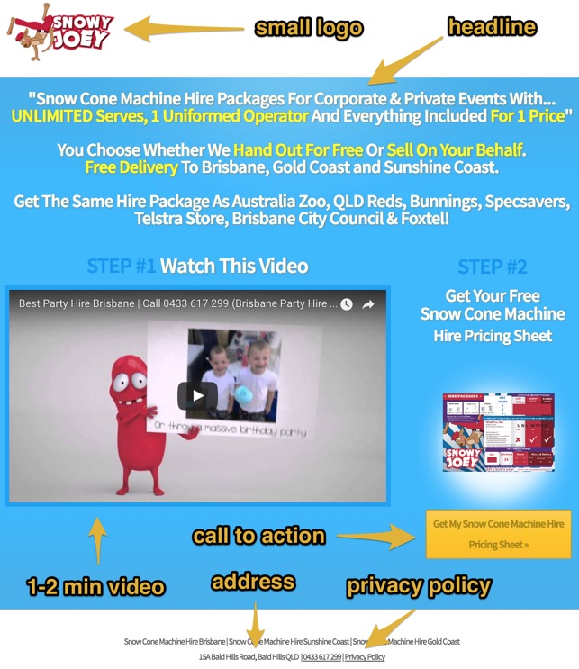
Here is a short case study of how I used the formula myself in my business to find new customers to buy my Snow Cone Machine Hire Package product from people searching on Google in Brisbane, Australia.


Here is a full breakdown of 1 of my AdWords campaigns:


Campaign Name: Brisbane Hire


Ad Group Name: Snow Cone Hire


Keywords:

+snow +cone +machine +hire +brisbane

+snow +cone +hire +brisbane


Ad Copy:

brisbane-adwords-ad-copy


Landing Page:

snowcone-adwords-landing-page
Note: this page cannot be found on my main website, it is a dedicated landing page I set up specifically for AdWords.


The Simple, Yet Unusual Sales Funnel That Converts My Leads Into Sales


Now let's break down my sales funnel after I collect a lead from AdWords…


You can see from my landing page that the first step people need to take to enter my sales funnel is to download a pricing sheet. The reason I do this is because I want to build an email list.


My email list is a business asset I can use to stay in contact with my hottest leads every month about special product offers and news. If people don't decide to buy after opting-in, I can automate follow-up with them via email.


If you don't want to collect email leads via AdWords like me, you don't have to. This is the sales funnel that I have found is the best for my business.


I have SaaS clients that target enterprise level clients where our landing page call to action is for a free enterprise software demo. And SaaS companies that sell to small businesses where our call to action is for a free software trial. I also have eCommerce clients where we send people straight to a product detail page to buy.


Do what makes sense for your business.


Just keep in mind, in general, the higher level of commitment you are asking for on your landing page, the lower your conversion rate will be. I also use Google Shopping Ads to send people straight to my product pages to buy. But my Google Shopping Ads campaign structure and optimisation is a whole other beast for another article.


Now, back to my sales funnel…


After someone opts-in for my pricing sheet, they get sent an email with a download link to the pricing sheet pdf, and automatically put on my “Snowy Joey Hire” email sequence.


adwords-pricing-sheet-email


The 10 email sequence is set up as follows:
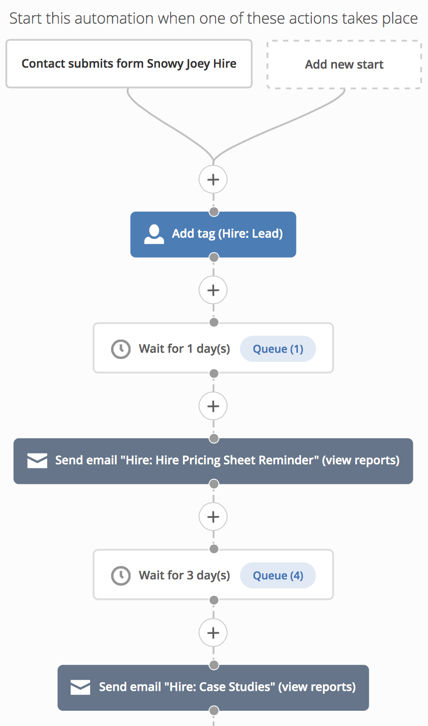

snowy-joey-email-sequence


I used a marketing automation tool called ActiveCampaign to create this email sequence. I use it because it is simple and for more advanced campaigns it allows me to move my leads from 1 email campaign to another based on specific actions they take (eg: click on a link to visit a product page). However for this sales funnel I'm not using any advanced automation (because I didn't want to get bogged down by all the automation rules in the beginning). It is a simple autoresponder sequence which is set up as follows after a lead downloads my Hire Pricing Sheet:


Wait 1 Day


Email #1: Hire Pricing Sheet Reminder

Email #1: Content: Link to the hire pricing sheet + product page


Wait 3 Days


Email #2: Case Studies

Email #2 Content: Link to a summary of all my businesses case studies (corporate and private)


Wait 3 Days


Email #3: Griffith University Case Study

Email #3 Content: Link to a case study on my blog for this 1 customer


Wait 3 Days


Email #4: 48 Hour Limited Time Offer

Email #4: Content: Free shipping + free product offer


Wait 1 Day


Email #5: Limited Time Offer Ending Today

Email #5: Content: Reminder that it is the last day to get the free shipping + free product offer


Wait 7 Days


Email #6: Kids Early Learning Centre Case Study

Email #6 Content: Link to a case study on my blog for this 1 customer


Wait 7 Days


Email #7: Specsavers Case Study

Email #7 Content: Link to a case study on my blog for this 1 customer


Wait 7 Days


Email #8: QUT Case Study (case study for 1 customer)

Email #8 Content: Link to a case study on my blog for this 1 customer


Wait 7 Days


Email #9: Zupps Case Study (case study for 1 customer)

Email #9 Content: Link to a case study on my blog for this 1 customer


Wait 7 Days


Email #10: Australia Zoo Case Study (case study for 1 customer)

Email #10 Content: Link to a case study on my blog for this 1 customer


We use a ton of case studies with our household brand name clients to build social proof.


The Results


This email sequence converts leads to customers at 10%.


Note: That makes our effective conversion rate from AdWords click to sale 5.9% (compare that to average eCommerce physical product conversion rates of 1-2%).


From AdWords we collected 155 leads. So with a 10% lead-to-sale conversion rate, 15 of our leads converted into customers.


Our average initial order value for this product is $450. The profit on that is $300.


That means for a total ad spend of $343.38 we made $4,500 profit from this 1 campaign.


13.11X ROI.


That does not include repeat purchases. If you take into account that approx. half of our hire customers repeat purchase. That makes the average lifetime value of 1 customer $675.


That is 19.66X ROI.


Now You Try It


I hope you can see the potential of The Cookie Monster Formula for your company from this case study.


Yes, it takes hard work to create something great.


But with this strategy you already know ahead of time that you have the best chance of getting your AdWords campaign to ROI (unlike adding all the keywords you want your business to show for into 1 campaign, and sending all the traffic to your homepage hoping that people convert).


Just because I got a 13.11X ROI from my AdWords campaign doesn't mean it's going to work the same for your company. Everyone's target market, offer and sales funnel is different, so it's important to test this in your own company.


The best way to take immediate action from this article is to run 1 test campaign in your AdWords account and monitor the most important KPI for your company against your current campaign to see what results you get.


About the Author: Chris Von Wilpert is the Founder and CEO of Rocketship Agency.


Tuesday, 16 August 2016

How to Grind Customer Acquisition to a Halt with these Conversion Killing Design Trends

QR codes are largely pointless.


The concept is decent. But the execution is flawed.


Think about it for a second:


You're forcing people to take an additional step to download an application prior to using it (because let's be honest, only sociopaths have QR code readers on their phone).


Design trends like flat design, unconventional navigation and carousel sliders are no different. They sound harmless in theory. Some are fun to mess with. But most can do more harm than good if you're not careful.


They're also perfect examples of how herd behavior can actually backfire and grind conversions to a halt.


Here's why, and how to avoid it.


When Flat Design Strikes Back


Parallax is like the design equivalent to Andre's fashion.


When used with discretion, it can enhance the overall aesthetic, breaking up important sections of pages with visually intriguing movement that adds layers and depth to the site.


But that's just it. When is it ever used sparingly?


Parallax is an innocent example though. We can gripe about the minor drawbacks here or there, however it's not gonna kill you.


Flat design has been another wide-sweeping trend the past few years, with the goal of bringing simplicity back to user interfaces. Again, it's largely beneficial. Until it isn't.


The premise of the excellent Don't Make Me Think is somewhat obvious. The best user interfaces (and online user experiences) make it easy for people to intuitively find things or figure them out.


Flat design becomes problematic for example, when you leave form fields naked. Or if you strip away critical shading, colors and borders. The result, is that you're making key page elements – you know, the stuff you want people to do on the page so you can get more $$$ – completely indistinguishable to the common user.


Those visual cues were there not just for aesthetic, but to tell the user what to do (and where to do it).


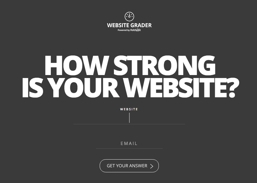
Again, flat design by itself isn't bad. What you do with it can be though. This HubSpot example below helps bridge the gap between using flat design to stay contemporary, yet providing interactive animations for the user like the form field lengthening (along with a blinking cursor) so visitors know exactly what to do when they get here.


hubspot-website-grader


Yet another example of cleverness sinking conversions are simple text links.


Links are one of the obvious primary page elements that (a) help people navigate or (b) are a precursor to conversions.


It should go without saying then, that text links should still capture some resemblance to the ones we've grown up on and become accustomed to seeing over the past decade+.


That means links should be some kind of blue. While an underline would also be nice.


This sounds so trite and obvious that we shouldn't need to debate or back up sources. But here's four for the hell of it.


Let's keep in mind though that many of these are relatively minor examples.


The more egregious conversion killers are still to come.


Putting the 'A' Back in IA


Information architecture (IA) is a fancy term that helps consultants charge more by making them sound smarter explains how stuff is organized on a website.


That means the logical organization of stuff into categories or buckets, how they're linked together, and how a user might flow from one thing to the next until they get to their intended destination.


The most obvious example of this problem comes when viewing your analytics data, and seeing people leaving your top pages in droves before they get to the money, err page.


Page navigation or menus should, in theory, help solve this. However that doesn't happen when they're multi-level navs or using overly vague naming convention as UserTesting.com has discovered after looking at 100,000 usability studies.


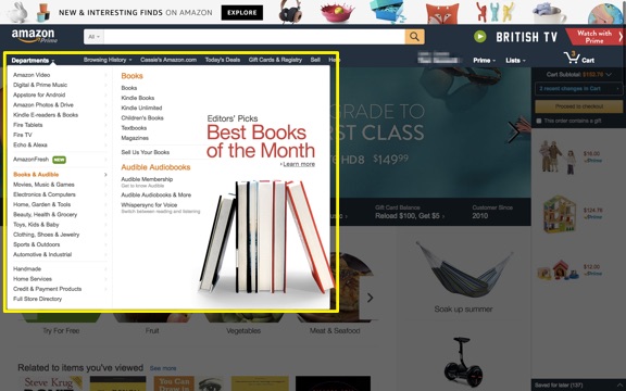
On large sites, they point to Amazon as a great example of using a large pop-out section to avoid the difficulties often associated with multi-level navs.


amazon-multi-level-navs


Largely because they can see all of their options at once, without needing the fine motor skills of a professional athlete to carefully select yet another drop down and avoid having to start over completely like a third grader that keeps failing the same level of their favorite Xbox game.


There should also be a clear site hierarchy that helps users intuitively understand what's primary, what's subordinate, and what's a subgroup.


Navigation labels can also trip people up, especially when uncommon terminology, overly clever or internal names are used in place of the obvious, yet standardardized options.


It's also a baby step away from talking past your customers and losing them entirely. From a broader perspective, it's also a perfect microcosm that illustrates when a company's worldview is completely opposite of their customers.


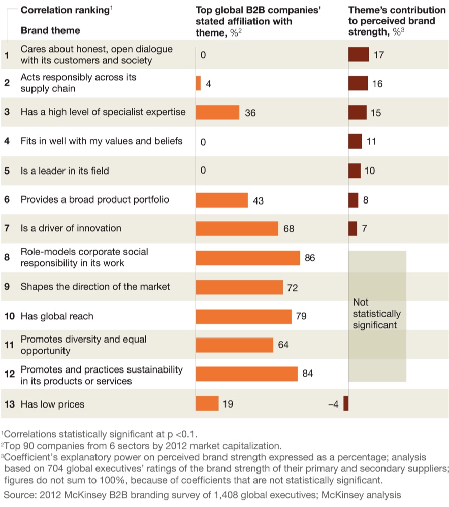
correlation-brand-strength-mckinsey
Image Source


When in doubt, standardize. Even better, is if you include some 'trigger words' that get people to take action.


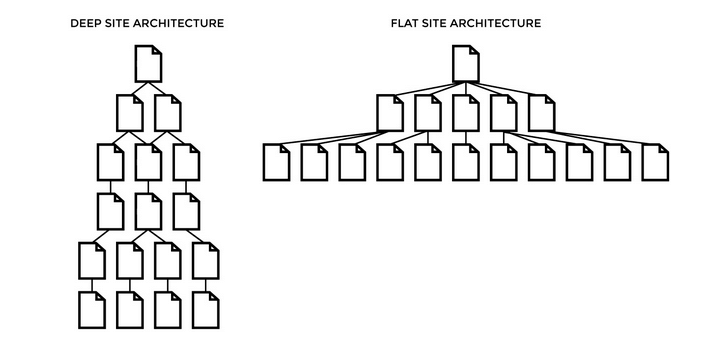
Beyond the design and labeling, keeping your site hierarchy flat can help keep the most important information just a few simple clicks away from most primary pages. Stuff doesn't get buried, or lost down a rabbit hole of endless subcategory scavenger hunts.


deep-flat-site-architecture
Image Source


Beyond helping visitors find stuff, which in turn should grease conversions, these improvements also help SEO. The better the organization, the more people come to the site, the better the experiences and the more conversions. (I would call this synergy if I wasn't afraid of you calling me a D-bag.)


All of these issues bring us to one of the biggest pet peeves of all. And this one really gets the blood boiling.


It's finally time to bring up the elephant in the room: F-ing carousels.


Carousels: The Epitome of Groupthink in Action


B2B companies love themselves some carousel sliders.


In a quick analysis conducted for Search Engine Land, one author found 18 out of 30 B2B websites (in different industries no less) all had one directly on their homepage.


Despite the data-backed facts that they're terrible usability, conversions, and speed. Three things that fly in the face of good web experiences.


Why are they so bad? Let me count the ways.


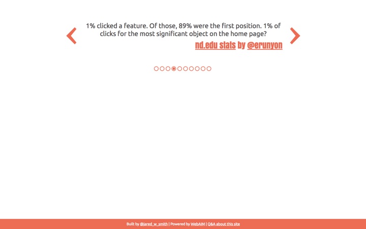
For starters, people don't actually use them (like less than ~1%). For example, peep the data from Harrison Jones' aforementioned Search Engine Land analysis:


carousel-conversions-website-stats
Image Source


In each of the three scenarios, the slide received a less than 1% click through rate. Part of the reason, is because these pervasive sliders can mimic banner blindness (thus causing people to ignore them entirely).


Beyond the fact that nobody actually clicks on them, they also commonly fail to load properly on mobile devices. While also potentially hurting SEO a number of ways by (1) not having static content (2) misusing header tags, (3) using high-res images that might slow the site down, and (4) resulting in 'thin' content if outdated technology is used.


should-i-use-a-carousel
Image Source


Ok, ok. If they're so bad, why do companies keep using them?


Compromise.


Therefore it's not just the carousel itself that's so bad. (Although as we've established, they do suck.)


What's so bad about carousels is how they happen.


They're the result of too many cooks in the kitchen. Too many HiPPOs in a room that all want their voice heard, or interests promoted, front-and-center on your website's most valuable real estate.


When design by committee happens, everyone loses.


Designers lose because their excellent work slowly erodes away.


Marketers lose because their voices get overrun and ignored.


And ultimately the very same HiPPOs lose because their selfish actions – well intentioned or not – ultimately result in a worse web experience for visitors, which results in lower website conversions and less revenue.


Conclusion


Offline, print design is static and passive. Its focus is on beauty and art.


However web design is about interaction. Its focus should be form and function. Utilitarian even.


Design trends like flat design, parallax, navigation structure and labeling can all have a significant impact on the success (or failure) of your site.


Elements like carousel sliders not only water-down your objectives, but actively work against them too.


The bad news about web design is that it's never finished.


But the good news about web design is that it's never finished. You're unable to truly fail if you own up to mistakes by quickly making them right through embracing testing and iteration.


About the Author: Brad Smith is a founding partner at Codeless Interactive, a digital agency specializing in creating personalized customer experiences. Brad's blog also features more marketing thoughts, opinions and the occasional insight.


Monday, 15 August 2016

How to Use Qualitative Research to Expand on Your Marketing Personas

The marketing persona is a tried-and-true customer segmentation strategy that many companies rely on to get the big picture about the people they serve. At the same time, these marketers and their teams are gathering copious amounts of data from and about those customers.


Because there is so much data out there, it can be difficult to tie all that information to specific segments. But that doesn't mean it has to go to waste. In fact, with the data you're collecting right now, you can make some pretty impressive leaps in better understanding and serving your customers. Here's how to do it.


Overview: What is Qualitative Research and Why Does It Matter?


Oftentimes, marketers will use terms like “qualitative research” and “quantitative research” to mean the same thing, when they are quite different. 


Qualitative research, as we'll discuss here, is understanding the motivation behind something, its underlying reasons, opinions and so forth. From a marketing point of view, it asks why customers behave or react a certain way. A video of a user testing session or a focus group are examples of qualitative research.


Quantitative research, on the other hand, looks at the numbers to quantify opinions, attitudes and so on to create results from a larger sample size. These methods include surveys, polls and telephone interviews. It is designed to uncover things like shifts in perspective or to detect certain user patterns. Many times marketers will use both to better create fuller, multi-dimensional user personas – however, it's the qualitative research that provides for the most insight in this case. The quantitative research simply backs up your findings.


To remember which is which, it may be helpful to keep in mind that quantitive is quantity. Quantity is numbers, and therefore quantitive research deals with numbers.


b2bresearch

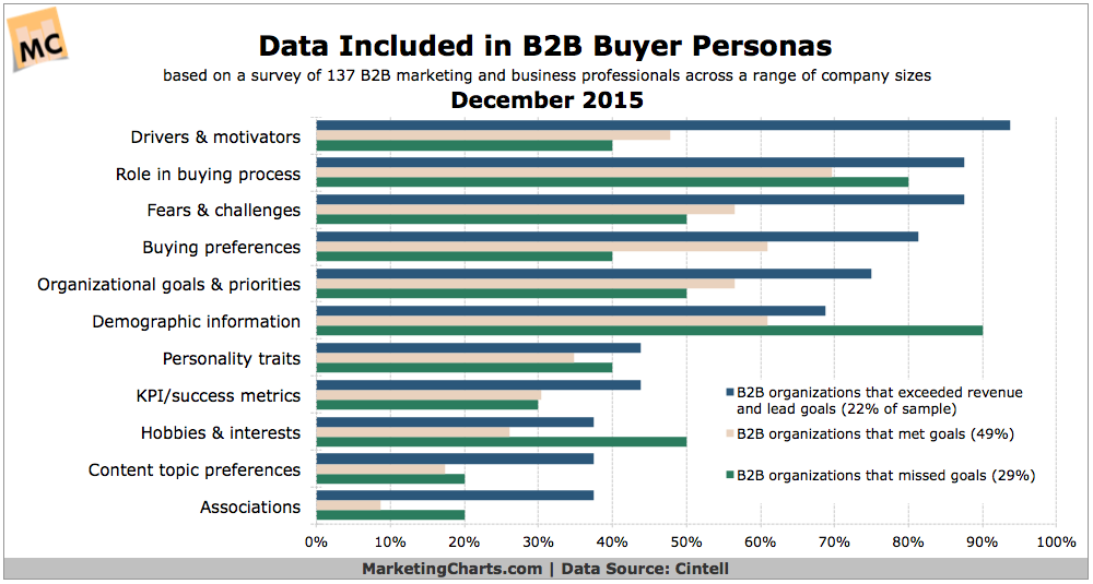
A study last year from Cintell shows that understanding drivers and motivators from customers is on the priority list of B2B companies


Uncovering New Customer Personas


marketing-bulb


By analyzing the qualitative data you're gathering, you'll start to see what motivates your customer to take action. But what if you can't tie that motivation to any existing persona? The solution is to then create a new one! These days there are now more tools than ever available to help you discover customer intent and monitor customer behavior. You can tap into the “person behind the metrics” to add new facets to your existing personas – the kinds of deep, granular detail that haven't been possible until now.


As your customer persona comes into better focus, you may even find some outlying information that just doesn't add up. That's where potentially creating a new persona, or an offshoot of an existing one, can help. New personas and segments represent a major positioning strategy that can give you that all-important “first mover” advantage with an untapped or under-served market.


Going Beyond the Numbers


customer-service


Another area where qualitative research shines with regard to marketing personas is getting at the underlying core of what makes that person tick. Humans are a fickle, ever-changing bunch, and it can be hard to pin down behavior of why they might abandon a cart one day and then seamlessly ride through checkout the next.


Marketers may look at the numbers to see that a great deal of people are stopping right before checkout and leaving without placing an order. The numbers tell us that much – but they don't tell us why.


Taking a more qualitative approach, such as videoing a prospect going through the process and recording their thoughts as they proceed provide accurate, clear and actionable reasons why they made the choices they did. There's no guesswork, no fruitless searching for reasons why. It's all out there in the open, ready to be acted upon.


This kind of live recording also captures many things that typical analytics cannot, such as eye tracking, facial movements and reactions, so you can see precisely the effect that your call to action is having on prospects. What are they focusing on? What are they ignoring? What are they struggling with and what questions do they have? These are all questions that can be answered in great detail by analyzing the qualitative information you've gathered.


Putting the “Person” Back in Persona


buyer-personas


Finally, you could look at qualitative research as the type of study that puts the person back in persona. Analytical numbers are great for determining technical mishaps, uncovering the best ROI channels and other areas where core numbers make a difference. But with marketing personas, much of what has already been created is based on what little personal information can be gleaned from those numbers. I'm talking about things like gender, location, referrer, device and so on.


These details are great for building the “skeleton” of a persona – but they do nothing to dive into the motivations behind their actions. And despite our capricious urges as online shoppers, many of the things we do are predictable and can be measured. We typically ditch sites that ask for too much information from their forms, or require us to create an account first. We take a considerable amount of time to read reviews and comparison shop on larger purchases, and we often look for recommendations from those we trust before we decide. It's not just human nature, it's smart business.


Qualitative research puts these kinds of actions back into the marketing puzzle. Imagine showing a focus group your new product and gauging their reaction to how you've chosen to brand it. What are they focusing on, and is it the same thing that you thought would appeal to them? So much of what can be built out of a persona based on numbers alone is pure guesswork – but being able to see their reactions, their focus and their feedback firsthand provides the kind of insights you can't get from charts and graphs.


Now It's Your Turn…


Are you using qualitative research in your own marketing analyses? Have you uncovered any new persona segments or discovered something completely new about your target audience as a result? Share your thoughts with us in the comments below!


About the Author: Sherice Jacob helps business owners improve website design and increase conversion rates through compelling copywriting, user-friendly design and smart analytics analysis. Learn more at iElectrify.com and download your free web copy tune-up and conversion checklist today!


Friday, 12 August 2016

Lessons Learned From Integrating Marketo into a SaaS Marketing Strategy

Marketo, the lead nurturing platform, is one of the best tools for marketers to create long-term relationships with customers, from creating prospects to converting them into advocates.


This “lead nurturing” is a proven tactic for moving prospects through a marketing funnel and improving customer engagement. For a SaaS business, which can oftentimes rely on personalized demos or free trials for prospects, nurturing can be a critical component of the marketing strategy. Considering that 40-60% of free trial users will never become paying users, it is especially important to use nurturing to educate and engage your prospects through content, as well as to ensure they understand the value of becoming a loyal, paying customer.


First Lesson: Nurture with Educational Content


Whereas traditional businesses make a sale once a prospective customer converts, SaaS businesses rely on the success of software free trials, creating a higher-risk, higher-touch relationship with leads who haven't converted into paying users.


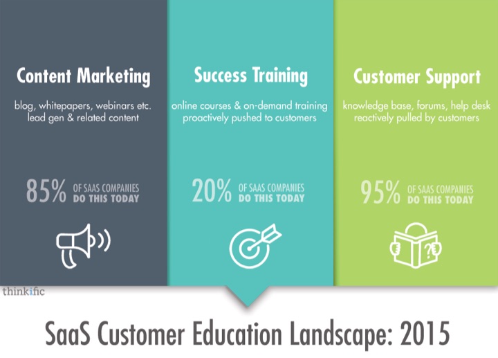
Baremetrics used educational content and other tactics to reduce churn by 63%.


customer-education-landscape
Image Source


But a lot of times, after bringing prospects into the funnel using educational and organic content, you may find yourself wondering: where are the conversions? When does the magic start to happen?


Second Lesson: Middle-of-the-Funnel Advantage


Because of the nature of the SaaS business model, there is a low barrier of entry for prospects. A common conversion point for many SaaS is a freemium model as it allows users to “try before they buy” into a subscription. Trouble is, once the user has already provided their contact info, the clock starts ticking. Unless your product is capable of selling itself, you're going to need informational and promotional content to convince trial users to convert to paying users.


Because of the number of prospects and opportunities in the middle of the funnel, SaaS businesses are forced to segment users on more than a demographic score but also on a behavioral score. This is the activity your users have taken to get to the point where they are now.


Nurturing users who are in your free trial is a great way to test the effectiveness of your educational content. If more users convert after being delivered targeted messaging, Marketo is smart enough to convey similar content, a technique called Content Personalization.


These middle-of-the-funnel nurture campaigns can help your prospects stay enthralled during the trial; they can also assist with the final conversion point: your product or service.


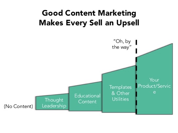
good-content-marketing-makes-every-sell
Image Source


First-touch attribution is the crux of any SaaS marketing analytics effort. Understanding where your customers are coming from and how to pour gasoline on that fire is the surest way to scale growth. Marketo does this well. Every user that comes onto your radar is tracked by IP, even without any other information about that visitor.


However, Marketo is more than an email service and “automation” doesn't simply mean customers are sent emails. Marketo also has a fantastic analytics feature and numerous integrations which can greatly improve every facet of your marketing process.


Consider These Implications


TRACK REPEATED USE


You cannot be passive and let free trial users sit idly by. Engaging and educating prospects should be a priority. Encouraging feedback and actual conversations with your customers is the only way you're going to make those relationship real. Thus, a metric for your software should be repeated use from nurtured users. There are a number of in-app integrations that can assist with this, but a simple one is Google Analytics. Set up a custom property to track users who are using your service. A more robust option is Kissmetrics.


SYNC WITH CRM


A database sync to Salesforce or another CRM is critical, so come into the process with a clean database in hand, or face the consequences. Your CRM will sync with Marketo and send data back and forth. Any mistake you make with Marketo will reveal itself on the CRM side. Unless you're a professional Salesforce Architect, be careful not to ruin years of work. You also certainly don't want to upset your sales team.


CUSTOMER-FIRST, FIRST


You'll need to sharpen your understanding of your customer base. Collecting emails for anyone who enters your funnel doesn't help you nurture, so identify a way to segment prospects during the conversion. A great example of this is to invite your newsletter list to download an industry-specific ebook or white paper. If they take the (free) bait, then you know they are interested in that content. If you think you need 13 points of personal data to close a sale, try to figure out a way to get one or two more pieces of data every time you communicate with your audience. Develop your nurture campaign after you've defined your ideal customer.


Third Lesson: Develop a Roadmap


Your roadmap should be customer-focused, which should be second-nature to any successful SaaS. Customers are interacting with your Marketo implementation just as much as your marketing team.


Make sure you include reporting in your roadmap. A solid reporting framework will take some time to set up. To avoid common first-timer mistakes, include a simple report in every smart campaign you set up, the first time you set it up. You can always improve the report and identify your stakeholders later on at the reporting level, but going through every active campaign and checking the flow will save you a few hours of work later on.


reviewtrackers-sales-flow


ReviewTrackers Process – Flow showing score and SQL alert.


Another good tip is to group alerts together using smart lists. Once a person (what a lead is called in Marketo) reaches qualification, ensure the right alert is triggered. Set up SQL alerts, MQL alerts, and a General alert, making sure the proper stakeholders are notified.


Lead scoring is the foundation of Marketo. Decide, with your sales team, how to establish a behavioral sales-qualified lead and a marketing-qualified lead. From there, develop your marketing-qualified leads as a ramp-up to the SQL.


You can add layers of personalization to every brand message you send your audience.


Setting Expectations, Managing Up and Down


You won't find a perfect solution, but the advantage of Marketo is the numerous integrations with third-party solutions that can help. Direct third-party integrations with Marketo can be found at launchpoint.marketo.com, so if your SaaS relies on one specific tool, you may want to check there first and see if it is available.


Software solutions are rarely “turned on with the flick of a switch.” Make sure your executive team is aware of the scope and timeline of a marketing automation integration.


If your SaaS is currently using automation, a realistic time frame for moving to Marketo is 3 months.


If you've never used automation, expect it to take 6 months. Even then, marketing automation is an endeavor which may take years to master.


Something will inevitably break: your API, your CRM sync, your nurture streams, or a webhook. By anticipating the disconnect, you can implement redundancies.


Fourth Lesson: Start With a Phased Implementation


Don't sync with your CRM on the first day. In fact, you may not want to sync with your CRM at all. Once you've synced to Marketo, there is no turning back. To implement this properly, start on-site with the Munchkin code, and split-test some leads with a Marketo form. These are your guinea pigs. As leads are added to your Marketo database, you'll be to able to see just how much power the software has.


Establish a pilot program, literally. Draw a line in the sand and announce to all stakeholders about the new automation program and be sure they understand the implications. Your sales team, your management, your social media agency, etc. Make sure they understand how the leads are different and what the expected outcome is.


Once you have a successful pilot program, move your newsletters and landing pages to Marketo. A/B test to ensure your copy and visuals haven't impacted conversions.


Finally, take the plunge. Sync your CRM. Drive traffic with email blasts, re-qualify old leads in your database, and add customers that have re-engaged to your nurture campaigns.


Set up reporting and make sure stakeholders understand the data. Not all CRM data will align with Marketo, so if there is a discrepancy, choose one reporting engine and stick with it.


Fifth Lesson: Adding Your Favorite Integrations


Chances are, there is a way to integrate Marketo with the tools and processes you are already using. Sometimes, you'll find an integration at the Launchpoint portal, but if you don't, there's a webhook for that. Here are some useful integrations for a SaaS:


SLACK


The Marketo-Slack integration has improved our productivity, reduced emails, and increased response time for customer inquiries. Through the webhook integration, our entire sales team is alerted of our customers and prospects' interesting moments, demo requests, and free trial conversions. They are able to quickly claim a lead, discuss opportunities and follow up, right in the Marketo channel. Jenna Molby has a fantastic guide for setup, which can be found here.


WORDPRESS


WordPress.org, the open-source publishing platform, is one of the most popular self-hosting options for website and blogs. Due to its low cost and easy customization, it is especially popular amongst the lean startup crowd. While there are some integrations available for Marketo and WordPress, it may be easier for most SaaS companies to use the gravity form add-on and Marketo munchkin code to track visitors on your site.


SUMOME


SumoMe is a suite of lead generation tools designed to grow traffic and increase conversions. It includes a number of pop-ups, pop-overs, slide-ins, and widgets that can improve newsletter subscriptions and social shares. The integration with Marketo is relatively new and the full documentation for integration can be found here.


Conclusion


For a SaaS, the middle of the funnel can be extremely important, especially for businesses with a freemium model. It can keep prospects engaged, educate them, and ensure they get the most out of your software. It can align sales teams and ensure they are receiving the most qualified leads possible based on prospects' interaction with marketing assets. It can help you reduce churn and improve retention. With a proper setup and numerous integrations, Marketo can communicate with customers at the most opportune moment, and deliver a personalized experience not possible with other automation suites. Integration in your SaaS marketing strategy is worth the effort.


About the Author: Brian Sparker is Head of Content Marketing for ReviewTrackers, a review monitoring and customer feedback platform designed to help companies efficiently monitor online reviews, manage reputation, and enhance the customer experience in ways that make a positive impact on the bottom line.


Thursday, 11 August 2016

5 Ways to Maximize Audience Engagement with a Single Word: Easy

Let's start with what might sound like an obvious fact: the more engaged your audience, the more likely they are to eventually give you money.


Engagement is, of course, a fluid concept that refers to a host of metrics, including bounce rates, pages per visit, session durations, attention minutes, scroll depth, media clicks, social shares, comments and micro conversions. For content-oriented sites - where “sticky” viewership is what drives sales - optimizing for engagement-oriented metrics is often the best way to maximize revenue.


Why? Because until you have a loyal, engaged audience that's hungry for your content - not to mention, an audience that actually trusts you - you'll never have a chance at monetization.


Unfortunately, the internet is a noisy place. The insane proliferation of all things content – not just blogging but social, mobile, audio, video, and app (thank you Pokémon Go) – have made engagement more difficult than ever. Today, the world's biggest bloggers and content producers are focusing their engagement goals on attention, customizing metrics tools to measure attention, and creating strategies that aim to attract attention.


So, what does it all comes down to?


One word: easy.


Unless your content is easy – easy to (1) scan, (2) interact with, (3) load, (4) share, and even (5) monetize – it doesn't stand a chance.


1. Easy to Scan


Just like the opening line above, this first tip might seem obvious. Sadly many brands still create pages without taking important aspects of their layout into account, such as the font sizes and typefaces of the text, or the use of bullet lists and subheadlines to break up the experience into digestible chunks.


When your visitors open your web pages and see long blog posts with ornate, small text that has no breathing room, this can immediately drive them to leave the site and find something else that's easier to follow.


Eye scan data shows that on the web, people don't exactly read very much. Instead, we “scan” pages, running our eyes from top to bottom along the left side of text blocks, in a pattern that resembles the letter F. When something catches our eye as potentially interesting, we'll read a few words across to the right, but then we move on. The more inviting your design and typography styles are, the more likely people will be to actually read complete sections of your pages.


f-pattern


Tools like FontPair will help you find the perfect Google Font pairings to compliment your site and brand messaging, which can, in turn, help increase your site's visit times and engagement performance. To create your stylesheets with selections based on FontPair's recommended combinations, you can easily identify the fonts most suitable for your brand, download them for free and start publishing pages that are optimized for engagement.


fontpair
Image Source


Alongside of a scannable layout and font, do not overlook the crucial role that visuals play in your pages ability to command attention. Content with relevant images gets 94% more views than content without relevant images, and infographics are liked and shared on social media three times more than other any other type of content.


As Neil Patel points out in his Guide to Creating a Killer blog:


Be sure to include as much visual content into your articles as possible.


The brain processes images far faster than text. Creating an attention-grabbing image at the top of your article is simply a great way to engage users and encourage them to read the article.


Adding images throughout the article also helps people keep reading, and encourages sharing.


Generally speaking, the more images, the better. Or at least to a point – you don't want to overwhelm people with visual noise.


2. Easy to Interact With


Engagement, attention, and interaction all go hand in hand.


In fact, interactive content is one of the most exciting solutions for keeping users engaged and interested in your site.


With interactive content, site visitors feel a heightened sense of attachment to your pages, as they've essentially played a role in how your content takes shape. By spending time interacting with your site, they're all the more likely to share their content experiences with their peers.


It's easy to create and embed interactive elements for your pages using tools like Playbuzz. A free platform for editorial use, Playbuzz allows you to create customizable content for your website in the form of quizzes, polls, flip cards and more. This platform is an excellent opportunity to increase attention minutes and social sharing, and it also helps inject a sense of meaningful connection to the user experience.


playbuzz-interactive-content
Image Source


What's more, interactive content is a powerful monetization strategy. Pura Vida Bracelets, for example, hit the Forbes 30 Under 30 list in large part due to their seven-question quiz:


The quiz has been taken by more than 37,000 site visitors, 18,000 of whom have opted to provide their email addresses, which is a mind blowing conversion rate of 48.6%. Not only does the quiz suggest the perfect bracelet, but also uses the data collected to highlight specific aspects of a visitor's personality. The interactive nature of the quiz can help create strong bonds between the company and customers who ultimately become brand evangelists.


In addition to quizzes, polls, and flip cards, another hallmark of making your content easy to interact with is online chat. Unfortunately, the mistake many companies make on the online-chat front is forcing visitors and customers to come to them through a confusing maze of email strings and on-site logins. Instead, make chat insanely easy by going to your audience through a native tool like Facebook Messenger. Messenger is an easy way to not only provide instant feedback and brand announcements, but to also manage ecommerce engagement.


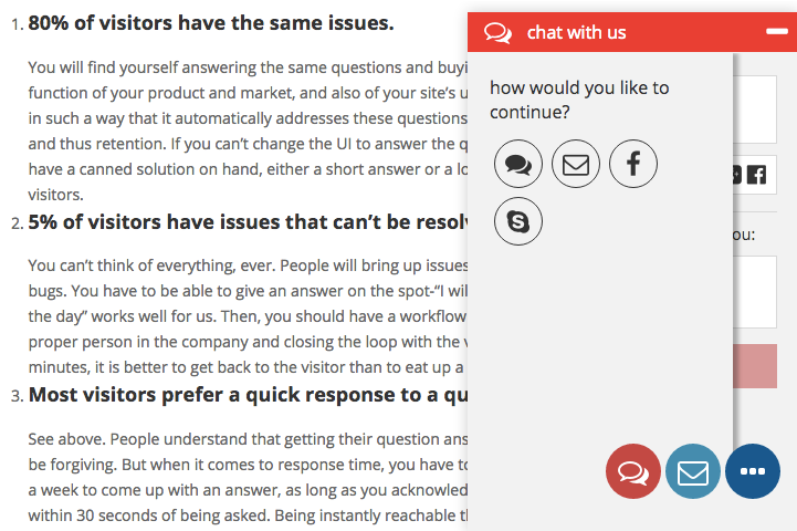
There are even tools like Bontact that allow marketers to offer multi-platform live chat to site visitors. So a conversation that starts in the widget on your web pages can easily move to Messenger, text, Skype, phone, email, screenshare or any number of other platforms.


bontact-on-website
Image Source


In the age of branded experiences spanning multiple devices, platforms, apps and customer journey phases, giving your site visitors the ability to interact with you on the channel of their choice can make a lasting impression.


3. Easy to Load


One of the biggest attention-killers for websites is the amount of time that it takes for the site to load. Over half of all web sessions are on mobile devices, which don't support the same connectivity speeds as computers. What's more, we're spending more and more time with our screens, so that time is becoming increasingly scarce and user patience is dwindling.


Data shows that just one second in load delays can drop conversions by 7%, three seconds of waiting for pages to load decreases satisfaction rates by 16%, and load time lags of four seconds make for 25% higher bounce rates. That's an engagement killer if ever there was one.


There are, however, solutions for improving your site delivery times, such as minimizing image file sizes with a tool like ImageOptim (Mac) or TinyPNG (web app) and using platforms like Google Accelerated Mobile Pages (AMP). Content Marketing Institute's recent “Tips and Tools to Ensure Speed Doesn't Kill Your Site” offers a handful of low-hanging, speed-optimizing fruits designed specifically for content marketers to implement.


For truly rapid page loads, however – especially in the world of ecommerce – you may need to look into non-DIY solutions. CMI's last tip is all about investing in a content delivery network (CDN), which is essentially a network of servers that host your site's media assets in different locations around the world, for faster access.


cdn-caching
Image Source


For best-in-class page load speeds, it's imperative to use intelligent and customizable caching algorithms. On average, websites that use CDNs are much faster and consume significantly less bandwidth than those that don't.


4. Easy to Share


Social sharing is, to a great extent, the highest level of engagement that there is.


When your site visitors share your pages, it means one of two things. Either they've enjoyed the experience so much that they want their like-minded peers to benefit from it as well, or they find your content so valuable that they believe sharing it will make them look good.


One of the best ways to maximize content sharing is to make it easy to do. When all it takes is a click of a button, people will be all the more likely to engage in this manner, putting you in great position to reach new audience members and expand your customer base.


warfare-wordpress-plugin
Image Source


Social Warfare is one of many WordPress plugins that can add attractive share buttons to content pages. This tool is optimized for speed and aesthetics, but it has other features that differentiate it as well. Social Warfare supports thousands of preset design variations, allows site managers to customize default share text, and even appends UTM codes to share URLs for superior attribution in Google Analytics.


5. Easy to Monetize


The content publishing industry today is faced with some serious financial challenges, as it's getting harder and harder to turn a profit. The online advertising ecosystem is in a state of disarray, with a lack of viable solutions for making money from mobile users, trade groups operating with inconsistent viewability standards, and rampant fraudulent billing practices.


What's more, in their efforts to grab people's attention, publishers have been allowing advertisers to book placements in formats that are too interruptive. This is why we're seeing the rise of ad blockers today, and to win our audiences back, publishers need to change the way they operate. There are even ways to drive revenues from content pages without turning your audience off by being too pushy, intrusive or forceful – ways that increase onsite engagement rather than killing it.


An effective way to achieve this is by integrating contextual ads into your content. Imonomy's technology scans your web pages and automatically pairs your site's images with relevant, engaging banner ads.


imonomy
Image Source


Because the in-image ads are displayed together with, and selected to match, your site's images, this platform delivers high viewability rates and improved engagement with your site's visitors. This, of course, translates to higher revenues in ways that don't compromise on content engagement.


Engagement Should Be Easy


It's essential to have a dynamic, thorough engagement strategy that maximizes interactions and time on site. In the words of Gary Vaynerchuk, “Attention is the single most important asset.”


If your company is unable to grab the attention of its target audience and keep them meaningfully engaged on your website, sustainable revenues will be hard to come by.


And the one word to remember – when it comes to engagement and attention – is easy. This means your content should be easy to …


  1. Scan

  2. Interact With

  3. Load

  4. Share

  5. Monetize


About the Author: Nadav is a veteran online marketer and the Founder & CEO of InboundJunction, an Israel-based content marketing company. Nadav helps well-known brands in boosting their online visibility through PR, SEO and Social Media.